These are some examples i find rather interesting and different, i will refer to these when coming to designing my final poster. My target audience is aimed at 18-25 year olds and i do believe that these sort of existing publications will grab there attention a lot.
This one grabs my attention a lot, it is designed by Michael Robinson who works for the 'The Guardian.' His intended message was global warming and health hazards. It is really easy to understand and very creative.

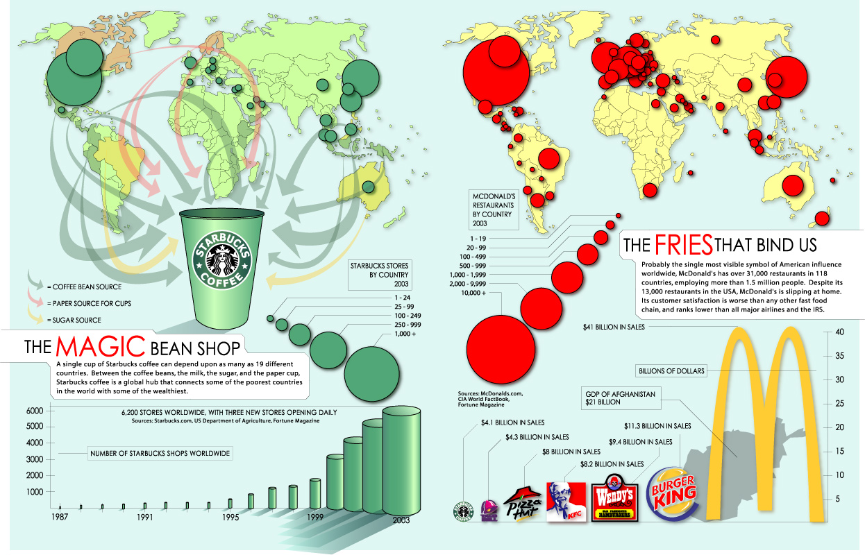
This is looking all over the globe at food and drink.
This information design is targeted at food companies worldwide.
This one grabs my attention a lot, it is designed by Michael Robinson who works for the 'The Guardian.' His intended message was global warming and health hazards. It is really easy to understand and very creative.

This is looking all over the globe at food and drink.
This information design is targeted at food companies worldwide.
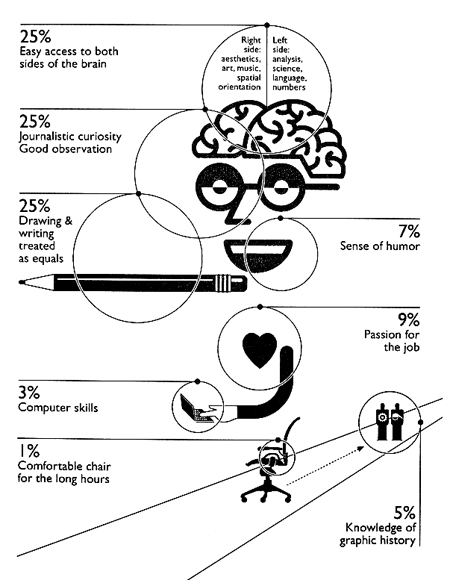
This i like a lot simply because its simple and effective and each symbol of the body represents a personailty/mood/skill. I could use this as an infulence when it comes to designing my statistic onto a poster.
This is basically focusing on colours and the different types of colours. i chose this to put into my blog because i really like the style of the diagram.


No comments:
Post a Comment